Pretty beats easy to read

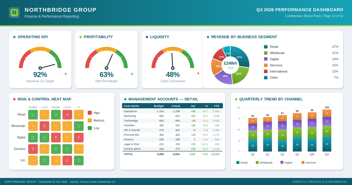
Look at a typical business report. The effort is obvious. The charts are in the brand colours. The KPIs sit in little speedometer gauges. The risks are a grid of red, amber and green. There is a table so dense the total has to be picked out in bold. It has been designed. And it is still hard to read.
That is the pattern in a lot of financial reporting. It looks like communication, but the design works for the organisation's image, not the reader's understanding. The brand colours, the polish and the sheer length say the writer took trouble. None of it helps the reader see what changed, by how much and what to do about it. That takes longer to find than it should.
There is now an international standard aimed at exactly this. ISO 24896, published in June 2026, sets a consistent notation for the charts, tables and text in reports, presentations and dashboards. It builds on the ISO plain-language standard, ISO 24495-1, and draws on years of work by the IBCS Association. The idea is simple. If everyone shows the same thing the same way, readers stop relearning the format on every page.
It is a good idea. I still don't think it will change much.
One barrier is cost. The ISO document costs 135 Swiss francs. Most people who write reports will never hear of it, and of those who do, few will pay a three-figure fee to read it.
But cost is a weak explanation, because the same notation is available from IBCS, published for free under a Creative Commons licence. The substance of what the ISO sells is available for nothing from the body ISO took it from. Free has been there for years. It has not fixed reporting either.
So the barrier is not price, and it is not awareness. Suppose the notation were free, well known and built into the software people already use. Most reports would still come out polished, on-brand and hard to read.
The reason is not that finance people are careless or vain. It is that the incentives all point one way. A report that looks authoritative signals competence. A report in the house colours signals that the writer belongs. A full page signals effort. Nobody's brief says "make it plainer, even if it looks less impressive." So the standard competes with the wish to look good, and looking good usually wins.
A standard helps the person who already wants to be clear. It gives them rules to point to and a reason to hold the line. What it cannot do is create the wanting. That has to come from the reader.
Reports get clearer when the people who receive them stop accepting the ones that are hard to follow. They get clearer when "I couldn't work out what this is telling me" is treated as the writer's problem, not the reader's failing. They get clearer when a board or a chief executive rewards the paper that made the decision easy over the one that looked the part. Change the thing that gets praised and the reports will follow. Leave it alone and no notation will help.
ISO 24896 is worth having. But the hard part was never the notation. The hard part is deciding that a report the reader can follow matters more than one that looks impressive. That is a choice an organisation makes, not a standard it adopts.