Data your reader will understand

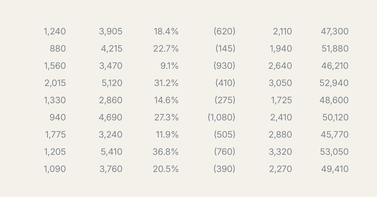
Open almost any board report pack and you will find one. A table that fills a whole page: thirty budget lines, three years of comparatives, variances in pounds and again in per cent, all set in eight-point type so it fits. Somewhere in that table is the one number the reader needs to act on. If only they could see it.
I hope I don't need to tell you this is not the best way to present financial data.
The cause is easy to miss, because it is you. You built the table, and every row and column means something to you. The reader meets it cold, with seconds to spare, and sees a wall of numbers. The problem is the same whether those numbers are in a document or on a PowerPoint slide: too much data, badly ordered, with no help for the reader. The fixes are the same, too.
Dos
Simplify the data. I keep telling writers to cut unnecessary words. The same goes for numbers. Do you need 25 lines in a P&L, or will 4 or 5 do the job? Do you need 5 years of comparatives? Do you need every figure to the pound when the story is about millions? Every row you keep is a row the reader has to read or skip, and most get skipped. Cut until only the load-bearing figures remain.
Write a headline, not a title. It is tempting to label a table factually: ‘Sales revenue by division, year to date.’ This is factually correct, but a waste of words. Think like a newspaper editor and write the headline of the story the table tells: ‘Sales revenue is 5% below budget’ or ‘Division X is growing fastest.’ Now the reader gets your message before reading a single figure, and the numbers confirm it instead of having to be decoded. On a slide you say the headline aloud and it is gone. In a report it sits on the page and does the work every time the reader's eye passes it.
Tell the reader where to look. In a talk you can reveal a chart piece by piece and set the pace for the room. In a document the reader sets their own pace, so the only lever you have is what you put on the page and in what order. Use it. Order the rows so the most important sits at the top, not buried in ledger order or alphabetically. Emphasise the figure that matters, in bold or with a shaded row, so the eye lands there first. Put your conclusion in the prose and let the table stand as the evidence, not the other way round.
Don'ts
Make one table do several jobs. A table answering three questions at once leaves the reader unsure which one you care about. Give each point its own small table or chart. There is no penalty for adding another table; there is a real penalty for crowding one.
Bury a big table in the body. Detailed tables belong in an appendix. If the analysis genuinely needs 30 rows and a dozen columns, put that table at the back, reference it, and in the body give the reader the handful of numbers that carry your point. The body is where you tell the story; the appendix is where a reader goes to check your working.
The test for any table is simple. Could a busy reader take your point from it in five seconds? If not, it is not finished.